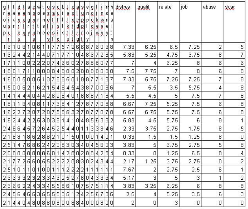
Prototype 1
Counting and Measuring
Wundt asked people to
make judgments about "psychophysical phenomenon" -- about weights for
example, he would say, "Does this weigh more than this?" and point at
two weights. He was the first one to try to measure things of the mind. Thurstone measured attitude and achievement. In these
examples there is some error in judgment on the part of the participant. Some
people are better at making judgments about weights than others. The same is
true for the "strength" of an attitude, emotion or achievement.
Psychological measurements (in fact all measurements) contain error and
consequently our assessments and the mathematical models (statistics) must make
provisions for such error. Psychology is not at the level of measurement of
other sciences. For example, other sciences have "scopes";
telescopes, the microscopes, stethoscopes, and the sphygmomanometers. The
measurement of personality and intellectual attributes has been harder to come
by--we have no scopes.
As a result of lack of
precision in measurement the statistics that we use must consider this
"error of measurement." Later in this chapter you will see that this
is variously called "error variance", "residual" and
"measurement error. This problem of measuring the mind is seen by some as
an impossibility of overcome. Emmanuel Kant said it. Popper restated it with
fervor.
The first prototype is that our assessment tools will contain error of
measurement and our analytical methods must estimate the degree of error.
Prototype 2
Big Numbers get even Bigger Results when
Multiplied
The set of numbers in
Box A shows that when you square numbers (multiply
each number by itself) that the results get proportionately larger with larger
numbers.
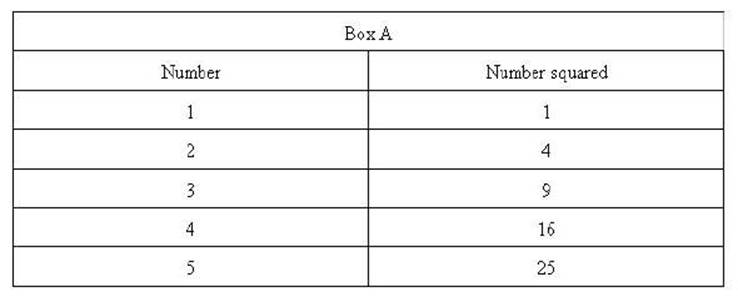
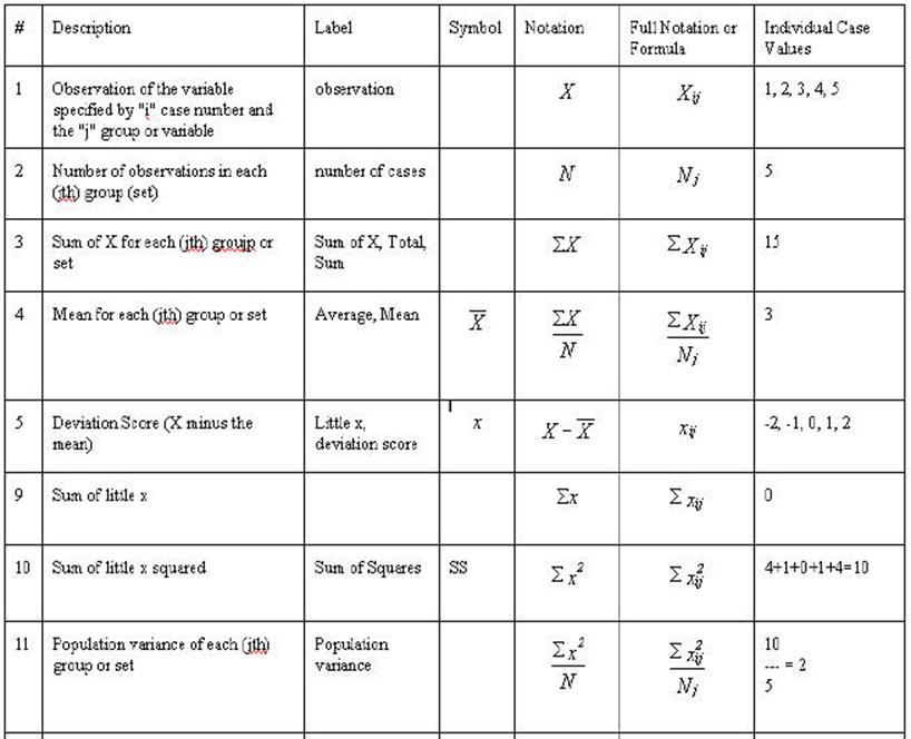
Each number of the set
(1 through 5) is squared resulting in the set 1, 4, 9, 16, and 25. Notice the
difference between the square of 1 and 2 (their squares are 1 and 4) is 3.
Whereas the difference between the squares of 4 and 5 (their squares are 16 and
25) is 9. The important characteristic is the difference
between the original numbers were the same (1) while the difference
between their squares are 3 and 9 respectively. The rate of change is proportionately
larger for larger numbers. That is, they get bigger quicker.
This is the second
prototype is that the results of squaring large numbers be disproportionately
larger than squaring small numbers.
One more example might be helpful to solidify
this second prototype. Add 1 to 5 and you get 6; multiply 6 times 6 and the
result is 36; the difference between 25 (5 X 5) and 36 (6 X 6) is 11. So once
again the "squared numbers get bigger, faster." It will happen all
the way to infinity.
Prototype 4
Using a Proportion to
Compare Things
One more prototype is
needed before a relationship can actually be assessed. We know how big (or how
much, or how far) something is by comparing it to something familiar. For example,
if we hear that someone weighs 250 pounds we think that's pretty big. We know
that because the average weight of a person is about 160 pounds. But how much
bigger is 250 than the average person. We divide 160
into 250 and find that it is 1.5625 and think the 250 person is about 1 and
half times bigger. We might have done it the other way around and divided 250
in 160 and found that it was .64 and found that the average person is about
6/10ths or 64% the size of the large person (we get the 64% by multiplying 100
times .64).
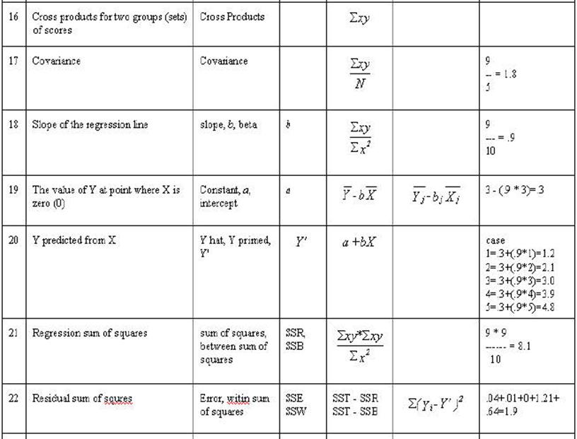
In prototype # 4 we are
going to compare prototype # 2 with prototype # 3 by the use of a proportion or
ratio. Are the squares (squaring each number and adding them up) bigger than
the products (multiplying the number in one set times the number in the other
set) of the two sets. The degree to which the products are as large as the
squares is the degree to which the two sets are related (this concept is key to
understanding the general linear model). If we compute a ratio between those
two results (sum of products and sum of squares), it in fact will indicate the
relationship between those two sets of numbers.
Most statistics are concerned with a
relationship between two or more sets of numbers. Consequently, the concept of a
relationship between two or more sets of numbers is central to the concept of
statistics. The prototypes that have been presented are all that is necessary
for conceptual understanding but some added calculation are needed for a
correlation, t-test or regression are known. Before the relationship between
two sets of numbers can be determined both sets need to have a range and
"anchor" point. The average or mean of the set is used for that
anchor. The steps that were carried out in the previous sets will be performed
on set below using the differences from the mean. The first set of numbers will
be identified as X and the second set identified as Y.
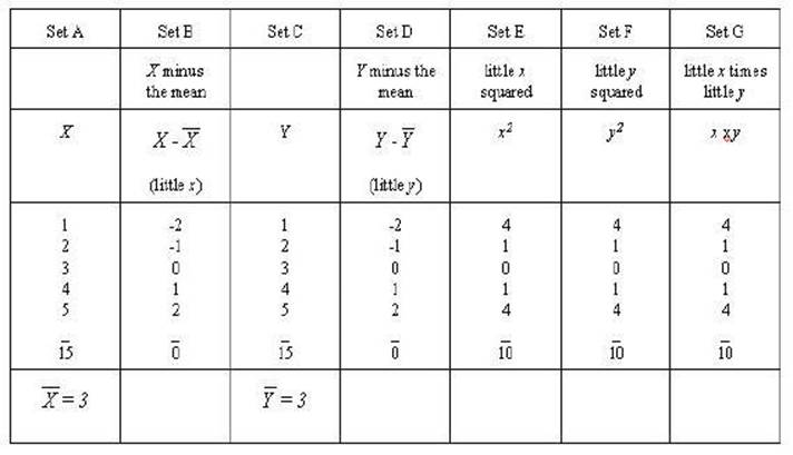
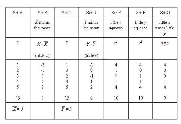
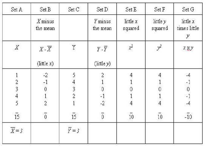
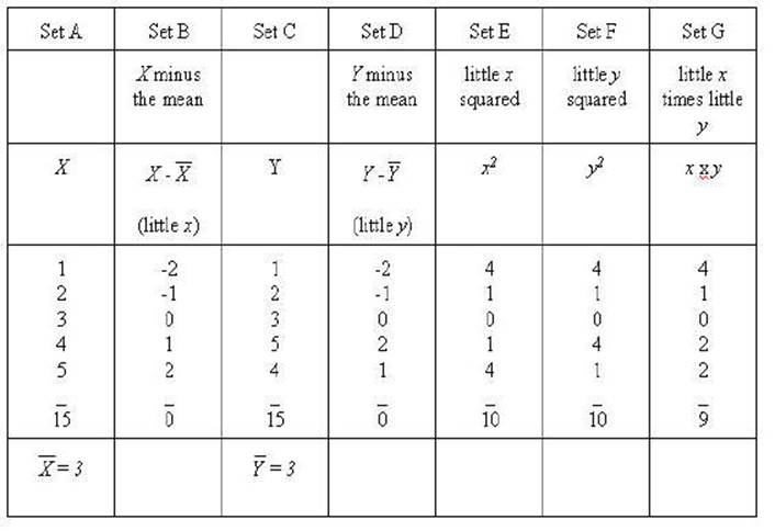
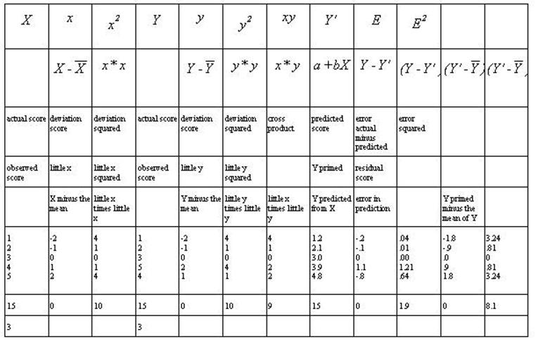
Set A and set C are the
same sets we have been working with Set B is X minus the mean (X
- 3) or x (little x) and Set D is Y minus the mean of Y
(Y - 3) or y (little y). Set E and Set F are the squares
of little x and little y respectively. Set G is the product of
the little y times little y.
It should be noted that
"larger numbers multiplied by themselves getting larger faster"
applies to "absolute values" (disregarding the signs) in this case.
That can be seen where -2 times -2 is equal to 4,
whereas -1 times -1 is 1. Remember squaring a set of numbers and adding them
together will result in the largest possible result for that set of numbers.
That is seen in little x squared and little y squared.
Consequently, multiplying x times y and adding those together
will indicate something about the relationship between the two sets. That can
be done by comparing the result of (the sum of little x squared), (the
sum of little y squared), and the (sum of little x times little
y-- or sum of the cross products).
The formal method of
making that comparison is called the Pearson Correlation Coefficient. It is
accomplished by the forth prototype -- the ratio. In this case the two squared
sets need to be averaged since there are two of them and only one of the cross
products. If all problems were as simple as this one we could merely add 10 and
10 together and divide by 2 giving the result of 10. However, these numbers
will usually be different and simple arithmetic would not take into account
"large numbers produce larger number" we must multiply the sum of x2
time the sum of y2 and then take the square root of that. In this case
the result is still 10. The final step is to divide this result into the sum of
little xy (x times y) that is divide
(producing a ratio) 10 by 10 the result is 1.00 indicating a perfect
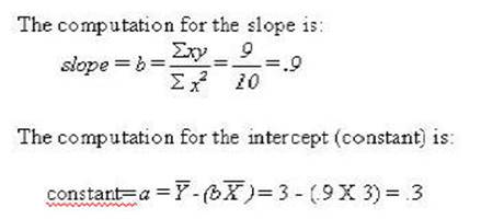
correlation. The formula that we have just worked out is:
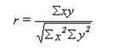
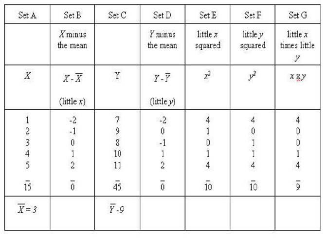
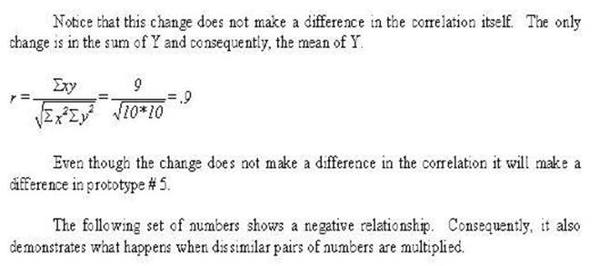
Notice that the only
changes made in the sums was the sum of xy. It has
changed to 9 rather than 10. That will result in a lower correlation.
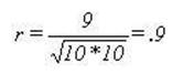
Another example is
needed to get to a real world example. In this example the scale of the Y
variable is changed while the correlation remains the same. A constant of 6 has
been added to each of the numbers of the Y variable.
Notice how all of the absolute results all remain
the same as the above example of the perfect correlation. However, the signs
changes in the sum of xy. Consequently, you can see
that it will now be a perfect negative correlation.
Prototype 5
How well does the Model
Fit the data?
The basic idea of this
concept is to make a prediction about the data (or anything in fact that can be
turned into data). You will see later how model or fit can be applied to this
concept. It is the prediction compared to the actual obtained scores. The mean
can be used as a prediction. For example, you might be asked to guess how much
Fred weighs. If that is all the information you have your best guess would be
the average weight of men. One the other hand if you also knew how tall Fred
was then your guess could be much improved. Such improvement is the focus of
this section. The prototype will be the regression line. It is the basis of the
general linear model.
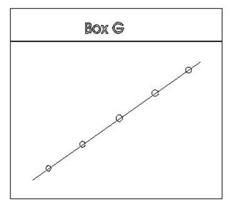
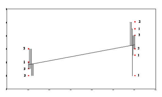
To make this prediction we need a straight line
that passes closest to all of the points. In Box G it is easy to find a line
that would pass closest to all of the points. In fact the line can pass through
all the points.
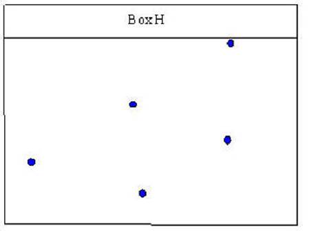
In Box H it is not as
clear where to draw a line that would pass through all of the points.
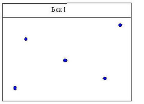
Box I is similar in that
one does not quite know where to draw a line that will be the closest to all of
the points in the box.
One way to make the
assessment would be to measure the distance from each point and add up those
distances and then draw a new line a make the measurements again and repeat the
procedure until one found the line that would result in the shortest measures.
There is a mathematical way to find the solution called the method of least
squares. The points of pairs of numbers can be plotted by having one set of
measures plotted vertically (y axis) and one set of numbers plotted
horizontally (x axis). Two numbers are needed to identify where the line should
be drawn: (1) the slope of the line and (2) where to begin the line.
The slope of the line (for predicting y when x
is known) is determined as:
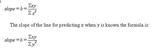
The convention in
statistics is that x variables are predictors and y variables are the criterion
or predicted variables, we will use that convention.
The second characteristic that is needed is
where to start or the intercept of y when x is 0. Or what is the value of y
when x is 0. It is the mean of y minus the slope times the mean of x. The
formula is:
![]()
Using the results of
these two formulae we can now plot the regression line. In order to keep use
connected to the task of learning to use the computer and SPSS the graph is
generated from the SPSS package. The following set of data will be used in this
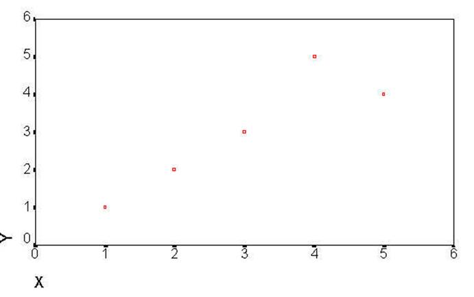
example (you have seen it before).
This regression can now
be plotted as a regression that is the line that comes closest to the points of
the scatterplot. The SPSS program will plot everything but the regression as
seen in the following Figure. The following syntax file will produce a plot
that will include everything but the regression --that has been drawn in for ourt purposes.
Plots of the data might be helpful in
representing Prototype # 5. You can get those in a crude
from the SPSS program (not that SPSS is crude). The following is a syntax file
that will generate the plot needed:
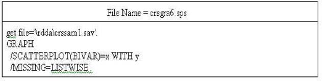
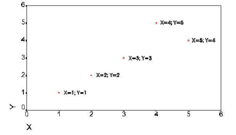
The following is the
produced.
The next plot is the
same plot that contains further explanation of the data points.
The next plot has been
further modified to show the regression line as computed above. The regression
line was drawn by starting at .3 on the Y axis when X was equal to 0 and
incrementing .9 on the Y axis for each increment of 1 on the X axis. The
formula use to generate the regression line was:
Y' = Y primed = a + (b times X).
The model is obtain in the following manner: (1) find a straight which
passes closest to all of the points of the variables when they are plotted on
the x and y axis. (2) Use this line to predict y scores from the x scores. (3)
The difference between the predicted score and the actual score is the error.
(4) Square each error score and sum the squares. (5) Compare the sum of squares
error to the total sum of squares. The comparison will result in relationship
of the variables or the fit. There are no new computations here -- it has all
been done in the above example. Only the concept is added. The correlation
itself indicates the fit. This is another way to conceptualize the relationship.
It becomes useful in the conceptualization of complex multivariate statistics.
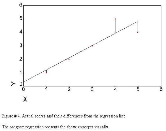
This sum of the
differences (lines drawn from the regression line to the observed values) is
the error in prediction: the degree to which the model does not fit the data.
The error variance is actually the sums of the squares of the length of these
lines.
The regression line is
the line that will come closest to all of the observed values. If the lines
drawn from the regression line to the observed values were added together is
would be the smallest of the values for another possible line that could be
drawn through the observed values. This graph represents Prototype # 5. The
regression line is the prediction (or model) and the lines
from the regression line to the actual data points is the error in
prediction. This represents the fit of the model to the data.
The regression line can be generated in SPSS in the following
manner:
Click on Graphs
Click on Scatter
Click on Simple
Click on Define
Select X variable
Click on the Delta Button to move the variable into the X-axis box
Select Y variable
Click on the Delta Button to move the variable
into the X-axis box
Click OK
Double Click on the chart itself
Click Chart
Click Options
Click Total
Click OK
Using the Five Prototypes
![]()
That completes the 5
prototypes needed to understand most statistics, now we can add operations to
them. Three different "sums of squares" (Prototypes #2 and #3) need
to be understood and compared (using Prototype # 4). Particularly, "sums
of squares total" (SST), "sums of squares between" (or sometimes
called sums of squares regression) - (SSB or SSR), and "sums of squares
error" (SSE). SSE was presented in the last Figure. Further it will be
useful to then present three sums of squares by three different method (1)
numerically, (2) geometrically, (3) as formulae, and finally (4) and Venn
diagrams. You should recognize that these are four ways of presenting the same
thing.
The three sums of squares (SST, SSB, and SSE)
are the basis of the "general linear model." Creative distribution of
the "sums of squares regression" among the variable can be used to
assess many different hypotheses or models.
In each case (numerically, geometrically, formulae, and Venn diagramically) the above example will include SST, SSB
(SSR), and SSE. At the same time I will "show my work" so that
information needed for each calculation needed will also be given.
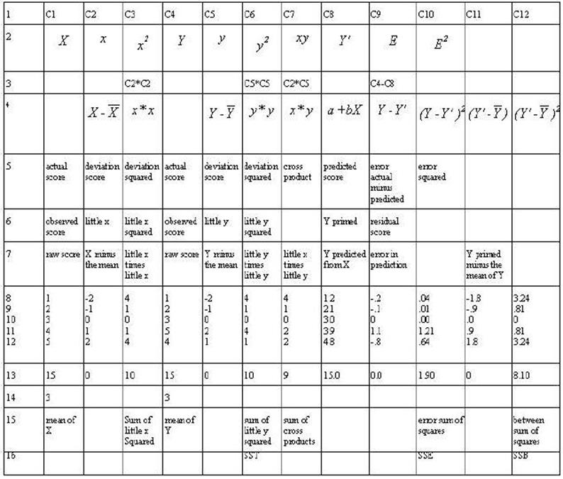
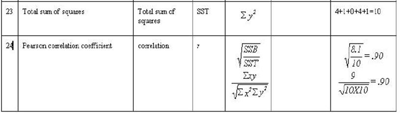
Table 2-3. Rows 1
through 7 are either mathematical notation or verbal description of
mathematical calculations of the numbers in the column. Rows 8 through 12 are
associated numbers involved the calculation. Row 13 is the sum of the numbers
in the column while row 14 is the mean for the column. Row 15 is the usual
verbal description of the sum in the column and row 16 is an abbreviation of
that description.
B. Geometrically.
The geometric
presentation of the model was started with Figure # 1 in the discussion of the
prototypes but it was not completed (although the prototypes were completed).
The "error sum of squares" was presented in Figure # 4; the
"total sum of squares", and "between sum of squares" are
presented in the next two figures.
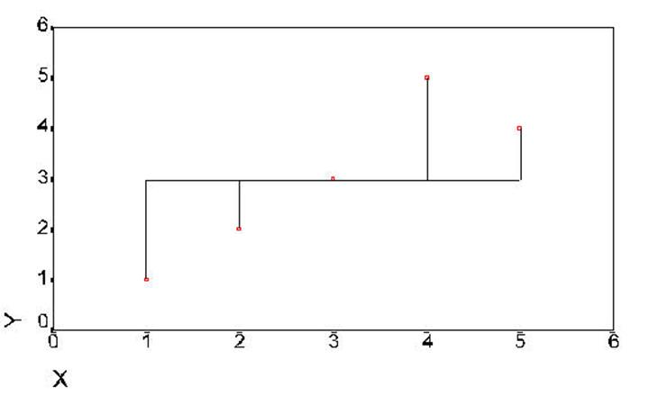
Figure #
5. Distences
from the mean -- total sum of squares (same as little y squared).
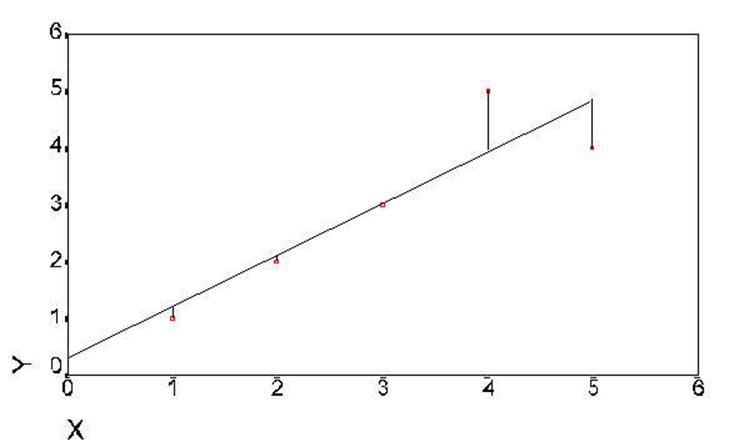
Figure 6. Distances of difference
between data points and regression lline.
![]()
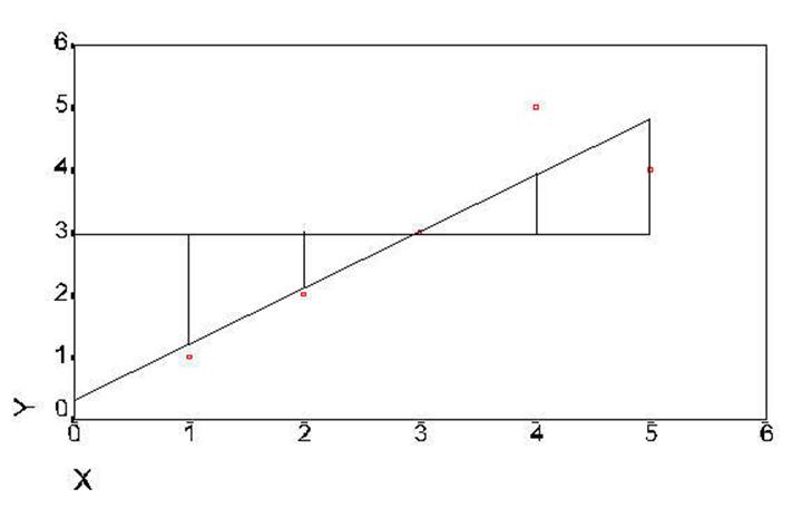
Figure 7. Distances between regression line and
mean of Y
This section now gives
the formulae and their names for a lot that is statistical. Think of it as
learning a new vocabulary (not a set of formulas). Its a way of talking. You may use either the name or
the formula. It will get you a long way. Only the standard deviation will be
new from you have already covered.
These formulae will
cover the essence of all of the statistics covered in this manual -- that is
they will work of the intuitive genotype if not the actual statistic. The
general linear model can be understood using this set. The statistics it will
help you to understand are correlation, anova,
(t-test), regression, multiple regression, manova,
factor analysis, discriminant function, canonical analysis, and structural
equation modeling.
We will next follow through with the above
example so that you have a concrete reference to come back to. The are
few numbers so that you can work in through easily.
All values of the
formulas above are represented in this example. There are five observations of
X (Raw Score X); therefore N = 5. Incidentally, there are also five
observations of Y. The values of X are 1, 2, 3, 4, and 5. The sum of X is 15.
Fifteen divided by 5 is 3 (sum of X divided by N) resulting in the mean of X --
ditto for Y.


A little more data for the General Linear Model
There are two analyses
presented in this chapter -- the formulae and computations are the same as the
analysis in chapter 2. More data has been added to make it a more realistic
problem. The second analysis is designed to show the similarity between
analysis of regression and analysis of variance.
This chapter builds on
chapter 2 and if there are points that you don't understand because of
complexity of numbers it might be useful to refer to the more simplified set in
chapter 2. A correlation between continuous variables is presented as the first
example then a correlation between a continuous variable and a dichotomous
variable will be presented. The similarities between this correlation and an
analysis of variance will be shown.
The sample data was
selected from a larger set that was administered to 5 different groups
including psychiatric inpatients and professional staff that worked with
psychiatric inpatients.
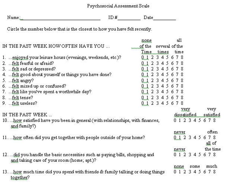
The problems throughout this chapter use sample
data from the preceding questionnaire. It should be recognized that is selected
data -- that is incomplete and selected for the purpose of this example. At the
same time is does represent results from a larger study. It is somewhat
exaggerated here in that the two samples are: (1) patients at the time of
admission to an inpatient hospital and (2) professional staff members. The data
is randomly selected from those groups excluding subjects who had missing data.
Only 20 cases were selected (10 from each group) so that the mathematical
calculations can be followed.
Click here for a presentation by Trochim. If anyone finds a better description please
post it.
The Graphic Representation of Sums of Squares ANOVA
This is
presented in same manner as the Graphic Representation of the Sum of Squares
Regression
The t-test can be
shown graphically in terms of the General Linear Model to develop
understanding.
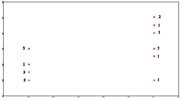
The following scatterplot was generated
from data taken from the Psychosocial Assessment Scale
This plot represents two variables DEPRES and
GROUP. There were three people in GROUP # 1 who answered 0 to the question of
"sad or depressed." If you look back at the raw data you will that
was participants 1, 5, and 6. There was one person in GROUP # 2 that answered
the question as 0. In looking at the raw data you will see that it was person #
16. There were two people in GROUP # 2 that answered the question as 8. There
were person number # 12 and person # 14. This scattergram
represents all the people of both groups. Once again the scattergram
represents a relationship. The smaller going with the small
and the large with the large. People in GROUP # 1 gave responses which
were smaller and people in GROUP # 2 (2 is larger than one) gave responses
which were larger than those in GROUP # 1.
The two variables DEPRES and GROUP follow:
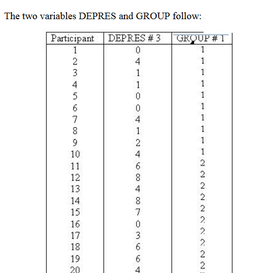
D
E
P
R
E
S
GROUP
Group
#1 Group
# 2
![]()
Sum-of-Squares-Residual (or
Sum-of-Squares-Error) are generated by taking the
distance from each data point and the regression line, squaring it, and adding
all of the squared distances together.
Sum-of-Squares-Regression (or Sum-of-Squres-Between) is generated by taking the distance from
the mean of Y and the regression line and squaring it. This is done for
each data point. Each of these squared distances is added together to
become the Sum-of-Squares-Regression (Sum-of-Squares-Between).
The Total-Sum-of-Squares is generated by
squaring the distance from the mean of Y and each data point and then summing
the squared results.